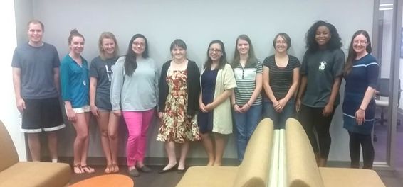
I am currently the Assistant Director of the Writing Center at the University of Mary Hardin-Baylor. The writing center opened in Fall 2015 and I have been in charge of daily operations, training and supervising staff, and generally building the program since we opened. Above is a picture of my staff at the end of the Spring 2016 semester (I'm all the way on the right). A year and a half later, I now have 25 staff members and wish that I had the budget for more!
This is a document that I created about the UMHB writing center for my Document Design course. I took this course over the summer 2016 semester while I was working on reports for our first full semester that we were open, so this was a visual for my reporting process.
The infographic is a great demonstration of my ability to accept and incorporate constructive criticism. I originally designed it just for use in my writing center as a fun look back at this semester for my tutors. It was a lot more colorful and harder to read because I was trying to include too many details. Dr Kuralt suggested that i think about designing it for a wider audience such as faculty and administrators and that I think about how to use empty space more effectively. I then decided to use a more neutral background, spread out my elements, and rephrase the wording to fit the broader audience. This final version is something that I can use anywhere on campus.
This document demonstrates my ability to analyze a variety of rhetorical situations. As I mentioned above, the infographic was always intended for a professional audience and I redesigned it to be appropriate for administrators and faculty as well as tutors. I enjoyed adding school colors to the document to add interest and draw the eye to specific information but I kept the color sparse to remain professional.
